on
3 levels of complexity: How I approach data science storytelling
I vividly remember one of the conference talks I gave last year - there was a mix of data scientists, developers, and people from the business side. Despite the mix, there were definitely more technical folks, and the talks were full of math, neural network architecture graphs, or other concept deep dives.
My talk was no exception, and started off with explaining matrix factorization and collaborative filtering for recommender systems. However, after the talk, I got excellent feedback from folks from all ranges of roles saying that they understood the talk; one (non technical) stakeholder even said it was the “only talk they could follow from beginning to end”.
I bring this up because this is precisely why I enjoy public speaking. As a data scientist or developer, one can have a tremendous amount of impact on the business. However, often we rely on a middle layer of translation. I myself have encountered impostor syndrome that “technical people aren’t naturally good at presenting”.
Like any other skill, I believe public speaking and communication to be a learnable and trainable skill. In my professional growth, I’ve found it invaluable to help stakeholders understand why my team’s work is important; and thus over the years I’ve developed a “3 levels of complexity” framework to craft the storylines in my talks.
- 3 levels of technical complexity
- Level 1 - Help the audience understand real life impacts
- Level 2 - Bridge the context to abstract or technical
- Level 3 - Technical deep dives exist to do something
3 levels of technical complexity
 In the movie Inception, there are deeper levels of dreams, entered via free-fall.
The above gif is from the movie Inception, which is the story about a man who steals information from his targets by entering their dreams. As part of his job, he recruits a team to infiltrate the dreams of one particular target. In the above gif, they’re free-falling to enter one layer deeper in the dream, where juicier information is located in the target’s mind.
Now see, providing context is one of the keys about communication. Imagine that during a talk, I had just mentioned “the movie inception” and I didn’t provide a brief explanation of the movie setting. That would have alienated half the audience already, for those who haven’t seen the movie or have forgotten the storyline.
This would have been exacerbated in a talk; people will be distracted if they so much get the urge to google something. It’s the same with data science storytelling. Context needs to be explicitly given, not assumed, which when not done correctly, often causes a breakdown of communication. So hold onto that idea.
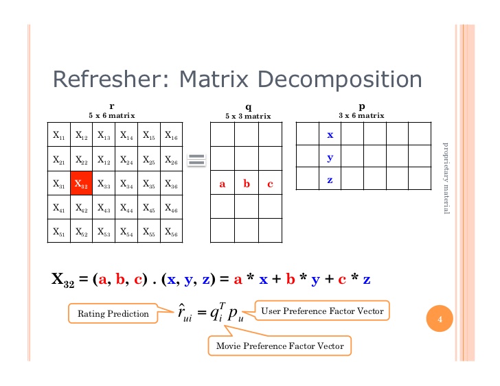 Matrix factorization. How does one present this to folks from all types of professional backgrounds?
Following, let’s examine the “3 levels of complexity” in data science storytelling, which is how I was able to help folks in different types of backgrounds understand Alternating Least Squares, the algorithm’s pros and cons, and how the project which implements it brings value to the business.
Level 1 - Help the audience understand real life impacts
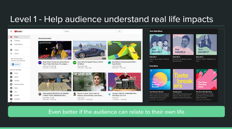
Spotify, YouTube, and Netflix recommend you shows that similar users watch, like how a friend who knows your tastes and has similar tastes would.
To begin explaining recommender systems, collaborative filtering, and the alternating least squares algorithm, I didn’t bring up any of those technical jargon yet. I simply mentioned YouTube and Spotify, which are services that the audience likely used or heard of before. They may have heard of “the YouTube algorithm”, and this talk gives an explanation of what is going under the hood.
Following this, I asked the audience why might it be important to our company, [or the client’s company, or the audience’s company], to use recommender systems too? I still hadn’t brought up technical jargon, but started with real life examples and the results or value add. This makes people motivated to spare my talk a bit more brainpower to understand the concepts I would bring up a few more slides in.
The following is an excerpt of how I prefaced the need to understand recommender systems and collaborative filtering:
It saves the business time and the users’ time, by helping the user avoid sifting through large amounts of information. This reduces overload, and increases user engagement. […] Imagine if YouTube had a person manually send you an email every time your favorite channel uploaded something new. Of course, we all know it’s automatic on the front page, commonly thanks to recommender systems.
Using examples the audience can relate to, helps it click in their mind. They might think - hey, this way of using data science to provide automatic recommendations was convenient to me (since I’ve used YouTube and Netflix), this will be convenient to our company’s users too!
Only after I provide this context, then I take the audience to a deeper level. It is important to note, that much like the movie Inception, one cannot skip through layers. It goes from high level to low, sequentially.
Level 2 - Bridge the context to abstract or technical
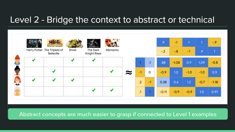
Shows can be recommended by finding similar users. What makes a user similar to you is if they have a lot of overlapping viewed shows with you, which, if you put them in a rows, and the movies as columns, can be calculated.
Now we try to bridge the context to the more abstract. To be fair, this really depends on the audience and presentation; in some situations only the first level is enough.
But many executives I’ve worked with are curious and want to learn at least a bit of technical detail, because they really want to understand the pros and cons of ML, so that it’s not relying on something mysterious. The underlying principles help them make better decisions for the company. So I need to take them to this deeper level.
Here on this [above slide’s] graphic, we want a dataset representation of each user and how much they like each item. Imagine this looks like an Excel spreadsheet with each row as a user, and each column, the shows/movies/products they have watched and enjoyed. The cells are filled with a score: that user’s rating of that movie, such as ⅘ stars.
To ease the audience into technical concepts, I usually connect technical jargon to items a broad range of people know and understand; in this case, I used Excel as an example. There is nothing more frustrating to the audience than trying to sit through an hour long presentation when they’ve totally derailed in the first 10 minutes. Hence taking time to set up the context, and a gradual descent through the levels, is worth it.
Finally, to prepare to dive into a yet deeper level, I start to use more terminology.
From here we can start to put it into a matrix form, which is what goes into the alternating least squares algorithm.
Level 3 - Technical deep dives exist to do something
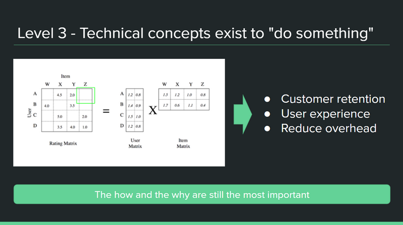
Alternating least squares algorithm is a type of collaborative filtering, using matrix decomposition from the rating matrix to user item matrices.
The 3rd level can dive into a lot of the jargon, but what’s important is the context that led us here and going down level by level, not skipping directly here and assuming that people understand, whether they are technical people or not.
People in this field have their own specializations, too; someone working in NLP may need a refresher on these recommender systems concepts.
In addition, remember to remind the audience what this jargon is here to do - we’re still just trying to solve that problem of recommending the right items or videos to the user at the right time, which saves them the effort of information overload and sifting through the vast amount of information.
By tying in the jargon with the reason why this is great for the users and for the business, the information stays for a long time.
Talks with less technical depth required
Now you’ve gotten to the last level, this is probably the only place jargon exists in the talk - but don’t get lost in explaining the terminology. Remember to connect it back to the previous levels, “why this is useful to the business” and “what these technical concepts are doing”.
Talks with purely technical knowledge sharing
The overall procedure is the same as with (non-technical) folks. I will always provide level 1 and 2, before diving in deeper; if I don’t, even the most nerdy of technical folks simply won’t care either why they’re listening and learning about this concept.
The only difference is that there can be a level 4, 5, 6… But everything else regarding sequentially moving from high level to low, and tying it back to why the audience should care, is applicable no matter who the audience is.
Conclusion
This concludes the framework of how I approach making my talks and my slide decks. It might seem like common sense, but it does take practice to remember to apply it to each talk. I’m always seeking to improve on public speaking, and have written more articles on the topic, so I’m interested if people have frameworks to achieve similar results.
As usual, you can find me on LinkedIn or hello@susanshu.com to discuss this post.
Additional thoughts on public speaking
- Increase public speaking confidence: 3 ways I’ve trained myself to not get nervous
- How I gave 5 talks in 10 days - my top 3 tactics for public speaking preparation
I have also spoken about this “3 levels of complexity for data science storytelling” topic in a webinar hosted by Marketing Research and Intelligence Association.